BlogSunday, April 06 2014
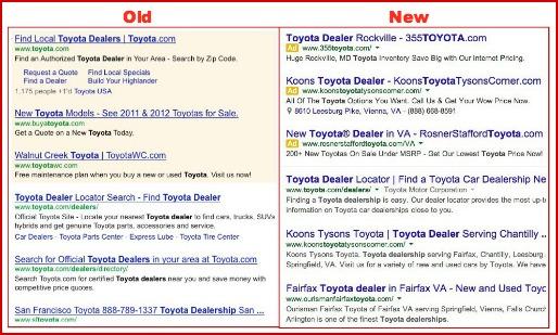
In March, Google made a number of changes to its search results layout. Jon Wiley, Lead Designer for Google Search, summarized the modifications in his Google+ post: We’ve increased the size of result titles, removed the underlines, and evened out all the line heights. This improves readability and creates an overall cleaner look. We’ve also brought over our new ad labels from mobile, making the multi-device experience more consistent. Previously, ads were placed over a shaded background and now, they are differentiated by a small yellow “Ad” button. People who cover industry news can’t seem to agree whether the new layout makes ads more obvious, or less obvious. Many believe the ads now blend in with organic search results and more people will click on them—an advantage, perhaps, for advertisers with well-structured PPC campaigns. |
|
|

